Plot Your Data
Common approaches for plotting data
For visualising Eratos Datasets we recommend the MatPlotLib library. This guide covers plotting 1,2 and 3 dimensional datasets as both Xarray and numpy arrays
Eratos Xarray
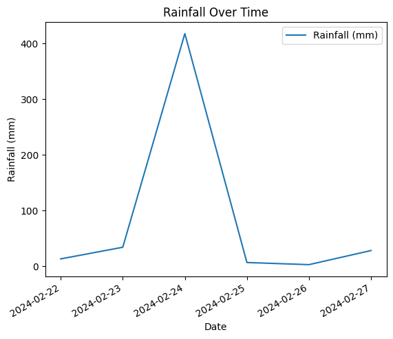
Time series data at a point

Using the MatPlotLib library, time series data can be easily plotted using the following code.
Note: your time and your key variable data should be stored in an Xarray
import xarray as xr
import eratos_xarray
import numpy as np
import matplotlib.pyplot as plt

bars_point = dataset

#Create a plot, label used for the legend.
bars_point["variable_name"].plot(label='Variable')

#Define plot labels
plt.xlabel('Time')
plt.ylabel('Variable')
plt.title('Variable Over Time')
plt.legend()

#Show plot
plt.show()
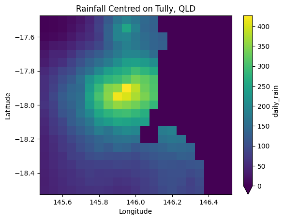
Gridded data at time point

Again using the MatPlotLib library, 2D gridded data can be plotted using imshow.
Note: your key variable data needs to be as a 2 dimensional array, across space in this example. The latitude and longitude are using for labeling the axis.
import xarray as xr
import eratos_xarray
import numpy as np
import matplotlib.pyplot as plt

bars_region = dataset

#Create a plot, label used for the legend.
bars_region["daily_rain"].plot(vmin=0)

#Define plot labels
plt.xlabel('Longitude')
plt.ylabel('Latitude')
plt.title('Rainfall Centred on Tully, QLD')

#Show plot
plt.show()
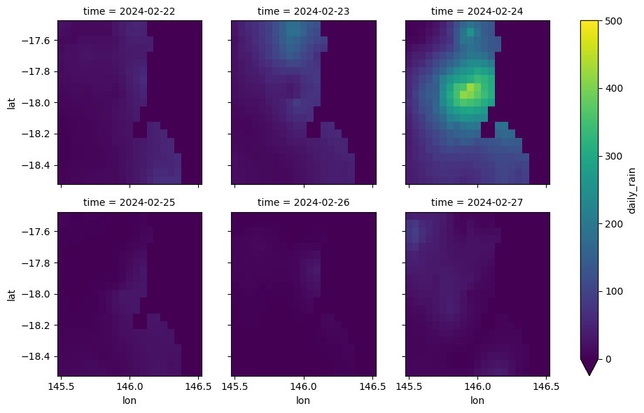
3D Subset (Space across time) Discrete

If the number of entries in the time dimension of the dataset is small, say 12 hours in a day or 7 days in a week, the previous approach can be extended to generate a subplot for each of the timesteps.
import xarray as xr
import eratos_xarray
import numpy as np
import matplotlib.pyplot as plt

bars_region_over_time = dataset

#Create the plot, note vmin and vmax define the colour grading
bars_region_over_time['daily_rain'].plot(x='lon', y='lat', col='time', col_wrap=3, vmin=0, vmax=500)

#Show the plot
plt.show()
Numpy Arrays
The following methods plot data if it has been extracted as a numpy array, which is the default datatype if Eratos Xarray has not been utilized.
Time series data at a point
Using the MatPlotLib library, time series data can be easily plotted using the following form.
Note: your time and your key variable data should be stored in arrays or dataframes
import numpy as np
import matplotlib.pyplot as plt

data_variable = selected_data['data'].values
time_variable = selected_data['time'].values

# Plotting
plt.plot(time_variable, data_variable, label='Variable')

plt.xlabel('Time')  # Assuming time_variable is already in a suitable format for labels
plt.ylabel('Variable')  # Adjust label as needed
plt.title('Variable Over Time')
plt.legend()  # Shows the legend if you have multiple lines or labels
plt.xticks(rotation=45)  # Optional: Rotates the x-axis labels to make them more readable
plt.tight_layout()  # Optional: Adjusts the layout to fit everything nicely
plt.show()
Gridded data at time point
Again using the MatPlotLib library, 2D gridded data can be plotted using imshow.
Note: your key variable data needs to be as a 2 dimensional array, across space in this example. The latitude and longitude are using for labeling the axis.
import numpy as np
import matplotlib.pyplot as plt

bars_region = selected_data #2D key data array plus geographic data

data_variable = selected_data['data'] # as a 2D array of datapoints
lat_variable = selected_data['lat'] # 1D array of lats
lon_variable = selected_data['lon'] # 1D array of lons

#Creat the plot
plt.figure(figsize=(10, 8))
im = plt.imshow(data_variable, cmap='viridis', aspect='auto')

# Set the ticks to correspond to the indices of lat_variable and lon_variable
# Assuming that every lat and lon value corresponds to a row/column in 'data'
plt.xticks(ticks=np.arange(len(lon_variable)), labels=np.round(lon_variable, 2), rotation=90)
plt.yticks(ticks=np.arange(len(lat_variable)), labels=np.round(lat_variable, 2))

# Adding labels and title
plt.xlabel('Longitude')
plt.ylabel('Latitude')
plt.title('Data Visualization with Latitude and Longitude Labels')
plt.colorbar(im, label='Data values')  # Show color scale

plt.show()
3D Subset (Space across time) Discrete
If the number of entries in the time dimension of the dataset is small, say 12 hours in a day or 7 days in a week, the previous approach can be extended to generate a subplot for each of the timesteps.
import numpy as np
import matplotlib.pyplot as plt

data_variable = selected_data['data'] # 3D array of data points
lat_variable = selected_data['lat'] # 1D array of lats
lon_variable = selected_data['lon'] # 1D array of lons
time_variable = selected_data['time'] # 1D array of timesteps

# Plot the data for each time step
num_time_steps = len(time_variable)

fig, axes = plt.subplots(num_time_steps, 1, figsize=(10, 8*num_time_steps))

for t in range(num_time_steps):
    im = axes[t].imshow(data_variable[t], cmap='viridis', aspect='auto')

    # Set the ticks to correspond to the indices of lat_variable and lon_variable
    # Assuming that every lat and lon value corresponds to a row/column in 'data'
    axes[t].set_xticks(np.arange(len(lon_variable)))
    axes[t].set_xticklabels(np.round(lon_variable, 2), rotation=90)
    axes[t].set_yticks(np.arange(len(lat_variable)))
    axes[t].set_yticklabels(np.round(lat_variable, 2))

    # Adding labels and title
    axes[t].set_xlabel('Longitude')
    axes[t].set_ylabel('Latitude')
    axes[t].set_title(f'Data Visualization with Latitude and Longitude Labels (Time: {time_variable[t]})')
    fig.colorbar(im, ax=axes[t], label='Data values')  # Show color scale

plt.tight_layout()
plt.show()
Updated 9 months ago
